
Color Story: Designing With Yellow
I’ve been hinting at some upcoming Yond projects featuring saturated color tones in unexpected ways. Of course, our team loves using moody blues and vibrant reds, but at the moment, shades of yellow are sitting top of mind. We are currently designing a kitchen in the perfect shade of yellow, so today's post is dedicated to inspiration centered around this primary hue.
We've pulled project images from fellow designers featuring vibrant yellows, subdued and earthy yellows, and everything in between. Read on to learn where to use yellow, how to create balance, and the seven yellow paint colors we know and love.
Design by Plain English Kitchens

Design by And And And Studio, Photo by Yoshihiro Makino

Design by LaTonya Yvette | Photography by Dane Tashima
Where to Use Yellow
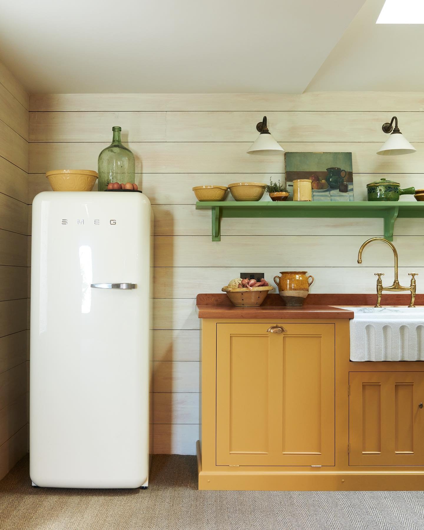
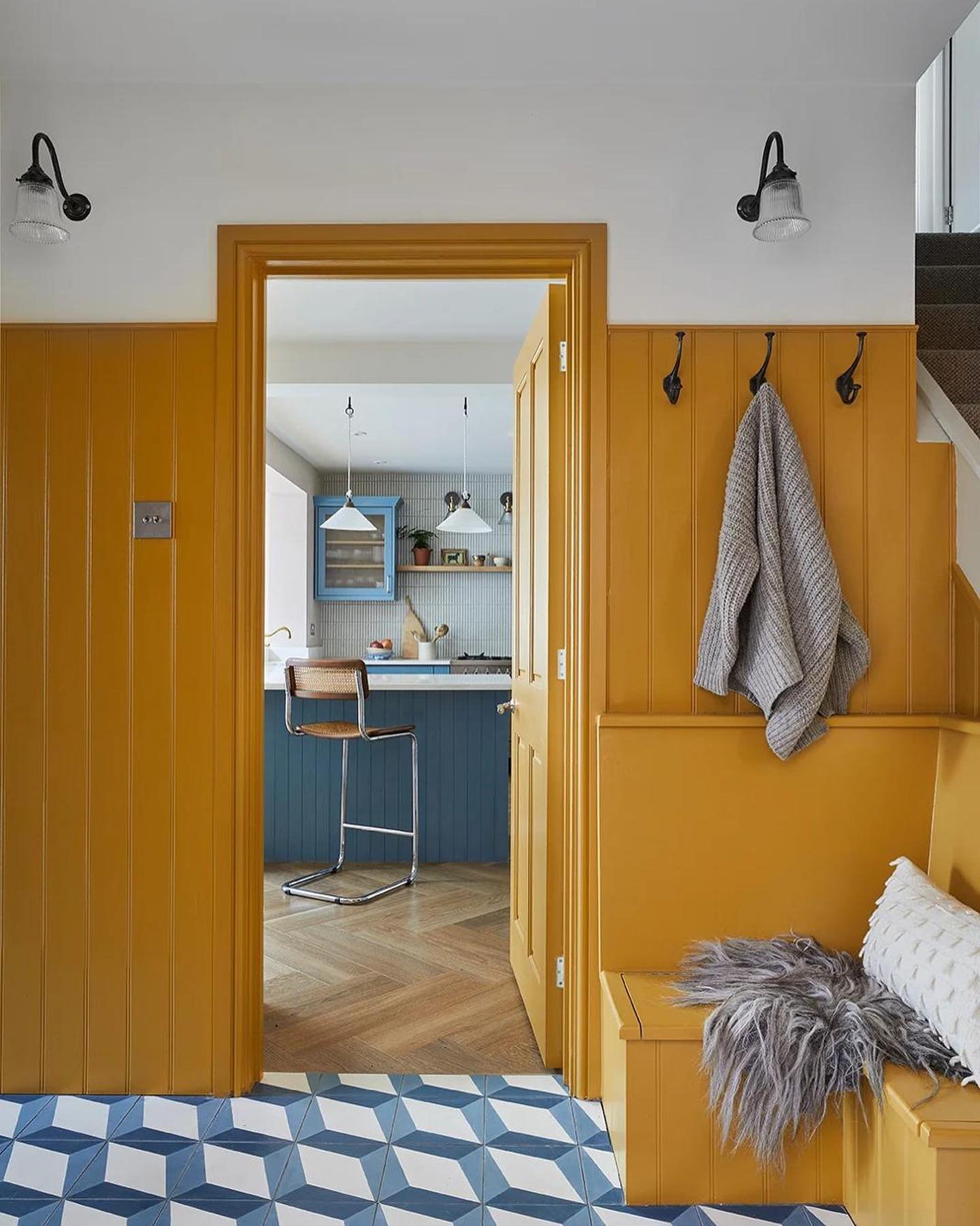
Yellow can be intimidating, but we've found that this sunny color can be perfect within the right context. Our projects have allowed us to use yellow on cabinetry, chair upholstery, rugs, small accessories, and even as a wall color. Yellow can also be great in a bold wallpaper, like this example from Pierre Frey. Cliche as it may sound, there's really nowhere entirely off-limits.
We're lucky to have an adventurous client who was open to all the color possibilities for her kitchen design plans. When we pitched the yellow kitchen, it was an immediate yes, and watching it all come together has been so fun.
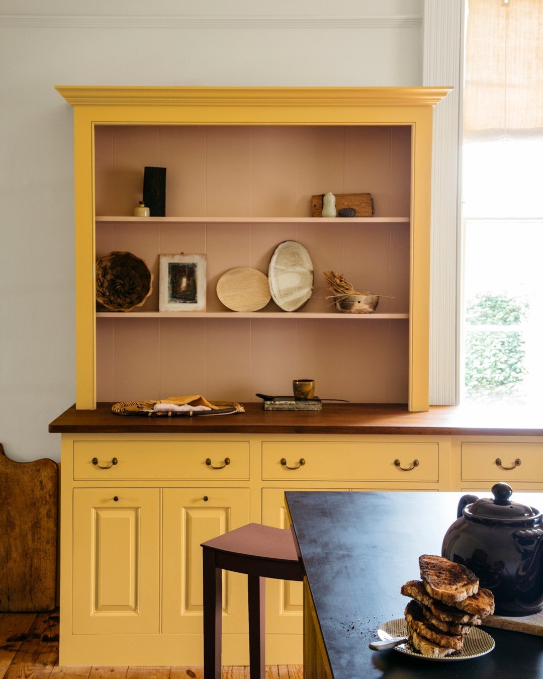
We find that if you go bold for the cabinetry, you'll want plenty of other colors and textures to support it. In our yellow kitchen featuring Sudbury Yellow by Farrow & Ball, we pulled in quartzite with loads of warm grays and taupes. Plus, we went with brass-toned hardware and integrated ceramic lighting for added softness and texture.
More to Read: Our Favorite Coffee Table Items

Design by deVOL Kitchens

Design by Katie Monkhouse | Photography by Stephanie Russo

Design by Rachel Donath
Design by deVOL Kitchens

Design by Yond Interiors | Photography by Amanda Birnie
How to Add Balance
When yellow is used as an accent, it can certainly stand alone. But if yellow is a focal point within a space, it's all about incorporating textures and contrast. We think yellow is the most successful in spaces with lots of natural light. This is especially true if you're designing with a brighter shade of yellow. More muddy, earthy yellows, however, can be very successful in even smaller spaces like a powder room. When using yellow on your walls, be sure to assess your natural light sources and consider how the tone will look and feel throughout the day.
More to Read: Color Study: Saturated Neutrals

Design by Plain English Kitchens

Image via Pierre Frey
Design by Vaughan Design & Development | Photography by Chris Snook

Design by Noel Pittman
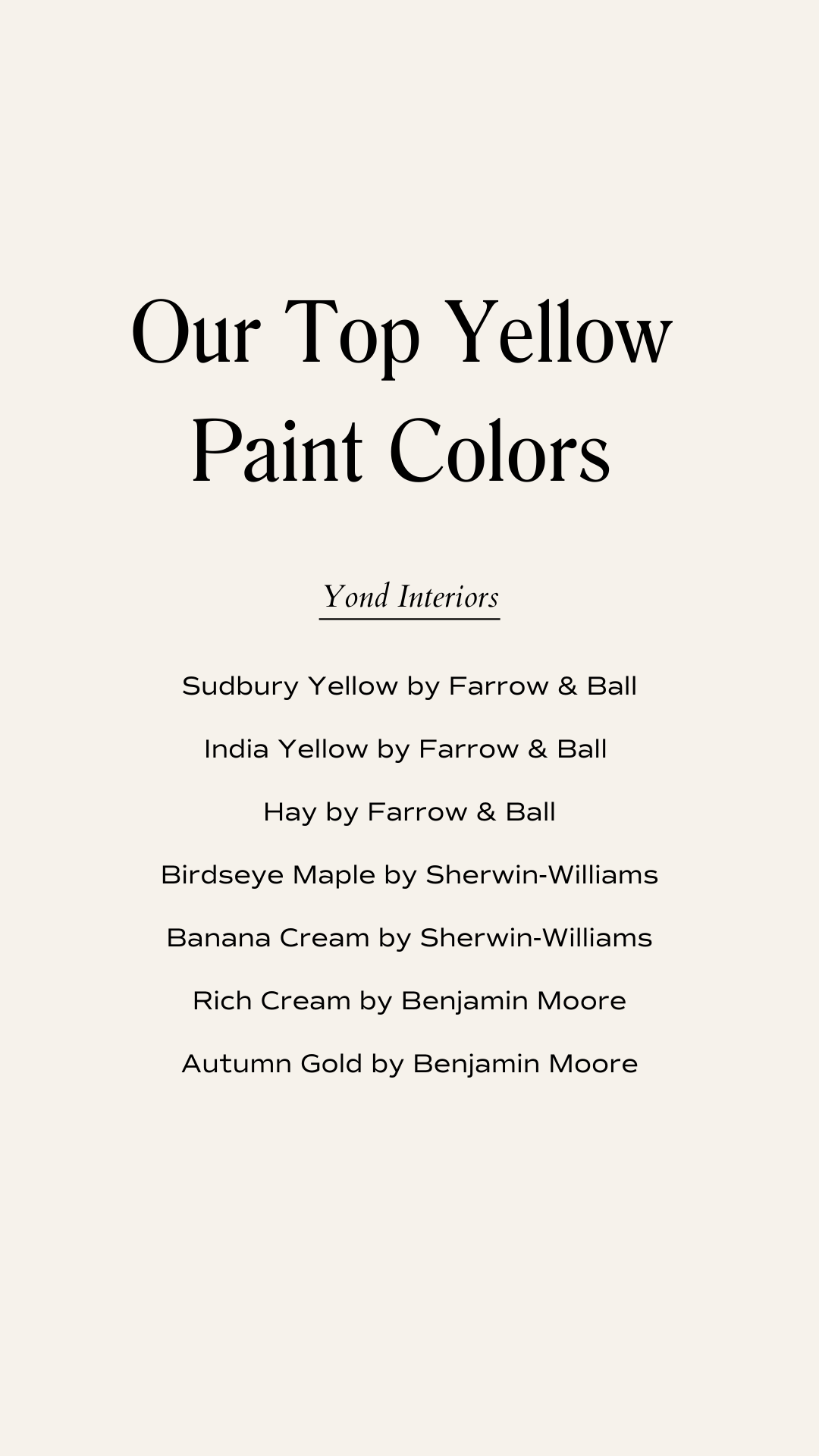
Our Top Yellow Paint Colors
Our design studio often prefers to use the earthy, warm hue of yellows. This variety of yellow is much easier to balance with other selections and pairs particularly well with muted earth tones.
Sudbury Yellow by Farrow & Ball
Birdseye Maple by Sherwin-Williams
We're so fortunate to have many opportunities to use this statement hue within our work. Our clients' trust has resulted in some incredible spaces, and we can't wait to share the Sudbury Yellow kitchen with you soon. We've found the best, most memorable projects always come from a trusting client with an adventurous spirit. That's where the magic happens.
In Case You Missed It
Get to know our small but mighty Yond Interiors team.
Take a look at all our latest projects.
Learn our strategies for designing a guest bathroom.
We’re answering the most frequently asked questions for interior designers.